Process for Kid Commerce
Summary:
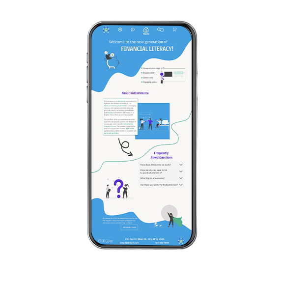
Design a versatile website capable of appealing to a wide demographic of parents and children of all ages. Ensure that the platform offers engaging and age-appropriate content for children to acquire financial literacy skills and foster financial independence through interactive games, simulations, and community -orientated activities.
Design a versatile platform for parents and kids that makes financial literacy engaging and age-appropriate with interactive games, simulations, and community activities.
Objectives:
- Approach the challenge with a dual user-centered design mindset to ensure that the website addresses the specific needs of both parents and children.
- Demonstrate the use of effective responsive patterns to guarantee that the website functions seamlessly and provides a consistent experience.
- Assess accessibility support across devices for an inclusive user experience.
Research
Design Tensions
1. Designing an interface that appeals to both parents and children of varying ages
Designing a single experience for parents and children 5-17 creates conflicting needs around visual language, interaction patterns, and motivation.
2. Age appropriate content and comprehension
Financial concepts need to center users' developmental stages without oversimplifying or overwhelming them.
3. Building trust with parents and retaining interest with children
Parents need transparency and control, while children need motivation and relevance.
Designing a single experience for parents and children 5-17 creates conflicting needs around visual language, interaction patterns, and motivation.
Financial concepts need to center users' developmental stages without oversimplifying or overwhelming them.
Parents need transparency and control, while children need motivation and relevance.
Discovery
*Note: This research reflects my thinking at the time of this project.
The discovery phase revealed that a single design would not adequately address the diverse needs of our user base. Consequently, I have chosen to develop a parent-oriented homepage designed to attract parents to our service, complemented by distinct portals and pages tailored to different age demographics. This approach essentially entails the creation of multiple user-centered websites housed within one unified platform.
The discovery phase revealed that a single design would not adequately address the diverse needs of our user base. Consequently, I have chosen to develop a parent-oriented homepage designed to attract parents to our service, complemented by distinct portals and pages tailored to different age demographics. This approach essentially entails the creation of multiple user-centered websites housed within one unified platform.
See full research details hereWhat the Research Told Me
Clearing the design tensions:
1. A single interface cannot effectively support children and parents without creating friction for one or both groups.
2. Financial literacy comprehension needs to adapt to user development.
3. Trust for parents depend on transparency and easy access to information. Engagement for children depend on engaging, familiar, and interesting content.
So..
How can we create a user-centric website structure that accommodates the diverse needs of our various audiences while ensuring swift loading times, optimal responsiveness, and numerous multifaceted and compelling content?
Inside My Design Thinking
Sketches and Wireframes
These sketches show my internal design dialogue with all the questions, doubts, and pivots that shaped the final solution.
" How can I make the homepage appeal to both parents and children? Do I NEED to have a single homepage? "
" How can I make the homepage appeal to both parents and children? Do I NEED to have a single homepage? "
" I will focus on the parents who will be subscribing on behalf of the kids. With a unique service, it needs a unique homepage. "
" I will focus on the parents who will be subscribing on behalf of the kids. With a unique service, it needs a unique homepage. "
" Not bad but still pretty stiff. I can do better, it'll come to me."
" Not bad but still pretty stiff. I can do better, it'll come to me."
These sketches and wireframes clarified the product's core structure, logic, and tone. They revealed the need for age-specific portals that balance clarity for parents with engagement for kids.
The sketches and wireframes clarified the product's core structure, logic, and tone. They revealed the need for age-specific portals that balance clarity for parents with engagement for kids.
Current Evolution
This project is ongoing. The screens shown in the prototype reflect the current design direction with additional flows evolving through continued research and iteration.

This project is ongoing. The screens shown in the prototype reflect the current design direction with additional flows evolving through continued research and iteration.
Switch to desktop to see the prototype.

I am a prototype!

Stay tuned...